Designing in a Sea of Blue
Aug 19, 2021 | Carpet One Floor & Home
Blue is without a doubt one of the most popular colors in the world. A reflection of the sky and ocean, it evokes feelings of purity, peace, serenity, and calm. When I’m working on a home involving more than one decision-maker (often with contrasting styles), blue is usually the saving grace and common denominator that moves the design process forward if the project is at a standstill. In addition, blue has literal value because it can increase the sale price of a home. With its immense popularity, blue can at times seem stagnant and “been there done that,” especially because it’s been so heavily commercialized in the world of home décor. Despite its marketability, it’s a color that will always have a place in my heart because of its versatility and range. To gain a better understanding of how to maximize its potential, it’s important to understand and recap the baseline principles of its color theory.
Color Theory and Impact
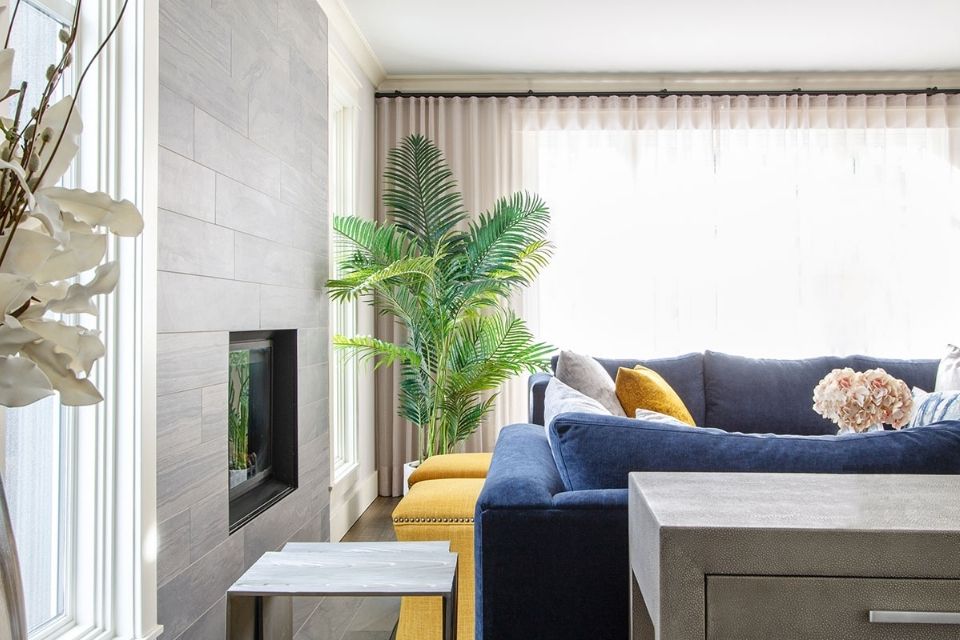
The idea of color theory can sound a little overwhelming, but, for the purposes of the home, there are three main components: primary, secondary, and tertiary colors. Primary colors are typically first taught in elementary school and include blue, yellow, and red. Secondary colors are created by mixing two primary colors together; they are green (blue + yellow), orange (yellow + red), and purple (red + blue). Tertiary colors, such as teal, violet, and amber, are created by mixing primary colors with secondary colors. Primary colors tend to be starker and bolder, whereas secondary and tertiary colors appear to be more natural and soothing to the eye. In general, the higher the usage of primary colors in a space, the more modern and graphic it will look, whereas greater levels of secondary and tertiary colors create a more fluid and transitional sensibility.
The warmth and coolness of colors also play an integral role in the overall design. A warmer blue tone means that it has more yellow in it, whereas cooler blues have larger quantities of gray and slate tones. A warmer-toned blue, like a pale robin’s egg, can be used in smaller rooms to add excitement and open them up, creating the illusion of larger and lighter spaces. Deeper blues are great for adding richness and creating depth and drama.
When deciding to go bolder with a darker and more dramatic blue, pay careful attention to the amount of natural light the room gets.
Applying a deep navy to a south-, southeast-, or southwest-facing room means it will see more natural sunlight, which can help diffuse its colder and more stoic nature. Applying the same color to a more conservatively lit room may appear gloomy, dark, and cold. Similar to wood tones, warmer-toned blues mix a little more fluidly with other warmer shades, and the same idea can be applied to cooler tones. This is not to say you can’t mix warm and cool tones, but there’s often an extra layer of thought required to ensure proper balance and harmony (usually with the addition of other textures and metals).
Pairing Color with Texture
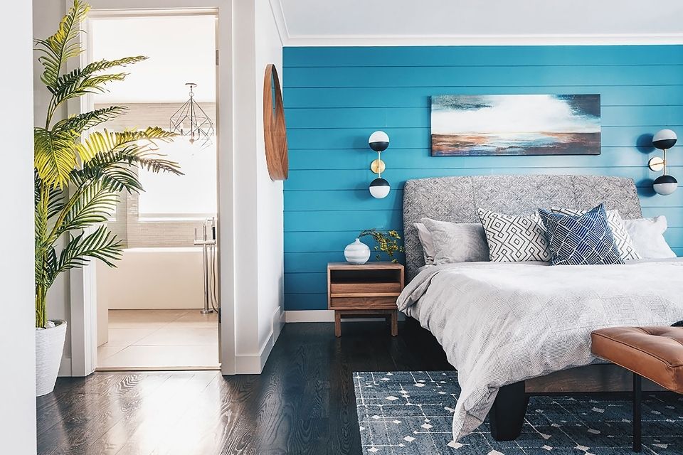
A variety of wondrous and magical things can happen when pairing blue with different textures. Using the right type of metal in conjunction with blue can be the difference between a room that doesn’t take flight and one that soars. Lighter, cooler, and paler blues naturally blend well with nickel, silver, and black metal. The addition of these metals can bring out the natural lightness and effervescence of these brighter notes. Darker and more moody blues, like navy and midnight, pair especially well with warmer metals, like copper, gold, and brass. They naturally add warmth and interest, drawing out their inherent richness and depth, similar to the addition of sunlight. This is a common combination in midcentury- or bold art deco–inspired palettes.
The Importance of Variety
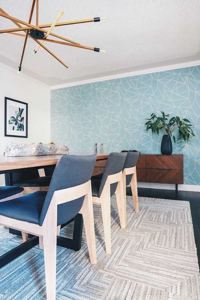
They say variety is the spice of life, and this is especially true when using blue because of its immensely popular nature. Have you ever left a show home or display suite and thought that there was something that didn’t feel quite right? Maybe it seemed a little too staged or slightly unnatural, but you couldn’t quite put your finger on the problem? In a majority of cases, the reason is because of a strong accent color with not enough variation and transition. An example of this is if you take a turquoise cushion and use the exact same color in a vase, in a print, and in a throw in every room of the house. Applying color this way can become “design by numbers,” leaving spaces looking artificial and devoid of any real depth or soul.
Bridging Shades of Blue
Whenever I design a home with blue in mind, I use a minimum of three shades. The more varying tones that can be incorporated, the better because, with each additional shade, you’re layering color and adding depth throughout, as opposed to having a singular point of focus. It allows for a more natural and gradual transition from one accent to the next, which makes it easier and more aesthetically pleasing to the eye. Circling back to color theory, the additional blue colors usually include secondary and tertiary shades in the mix. A color can look completely different simply with the addition of different transition colors to accompany it. An opulent royal blue can be made broodier and more dramatic paired with denim and cobalt or skew fresher and spritelier when mixed with a pale teal or sapphire.
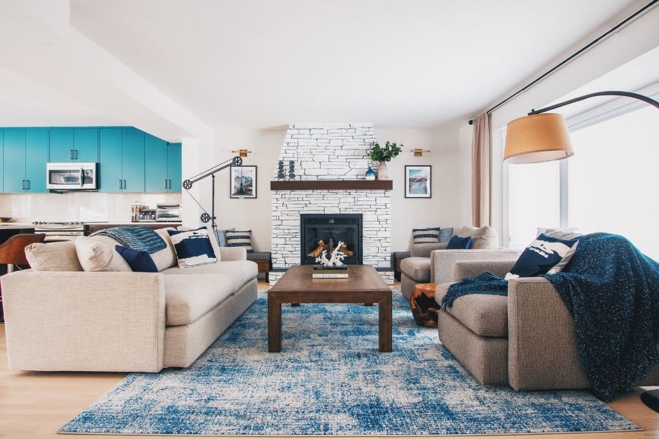
In addition to transition colors, it’s important to also consider bridging textures and patterns. Let’s say after a successful day of shopping, you pick up a vibrant turquoise cushion to accompany your dark, slate-covered sofa. Upon application, you can’t seem to bring the room to life. No matter what you do, it looks a little flat and one dimensional because the two stark elements are so disconnected. What you need to do is bridge the gap between these two separate entities with transitional notes so there isn’t such a harsh contrast. Consider a textured earth-toned throw (to add warmth to the slate couch) and an additional checkered navy accent pillow (to ground the bright turquoise cushion). This starts a dialogue between the cushion and sofa (two items that were otherwise quite isolated and disconnected), creating synergy and harmony.
Building a Color Story
The most important consideration to keep in mind when designing with blue (or any accent color) is to tell a story.
The best designs usually stem from an overall concept that the designer is trying to actualize or a concept that already lives in your own head. What is the overall sentiment of the space? Is it a coastal vibe? Bohemian? Maybe sexy midcentury or a global palette? Whatever it may be, focus on creating that bigger story before zooming into all of the smaller details. This is where homeowners can get into trouble and usually what causes a mini-breakdown while shopping (because you don’t know what you’re looking for or designing toward). At Louis Duncan-He Designs, with our natural West Coast perspective, we’re always striving to find ways to add in natural depth and organic qualities to fully realize a vision.
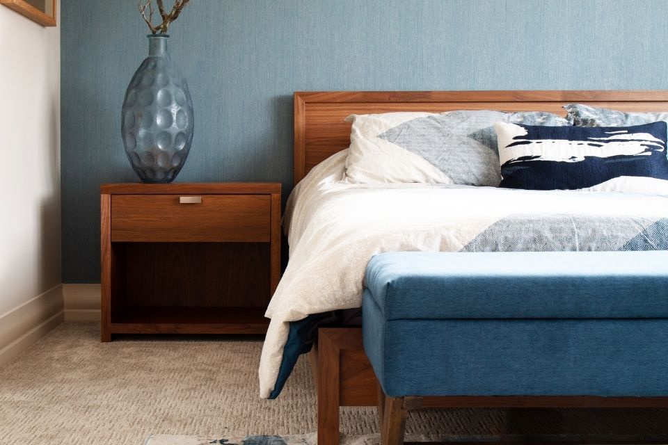
If coastal, natural, and West Coast is the name of the game, then think softer, paler, and more natural blue shades and textures. Baby blues and white coral mixed with rattan instantly tell a Hampton’s story, whereas darker navy, crisp white, and natural wood steer things toward the nautical. If you’re wanting a master bedroom with a bit of extra tranquility and calm, use watery and softer shades of blue combined with neutral beige, taupe, and sand tones to evoke the power of the beach and ocean. With a West Coast–inspired direction, mix richer blues, like cerulean, teal, turquoise, and ocean, with earth tones, rich greens, and varying shades of walnut and teak to infuse the spirit of the Pacific Northwest. Having a clear design direction at the beginning of the process will bring the space to life.
If modern and contemporary are what your heart is calling for, add primary colors and play with materiality. A bold primary blue mixed with clean lines and lacquered and polished surfaces instantly evokes a modern feeling. Dial up the volume of the room further with the addition of steel, abstract art, and a sculptural light fixture. For a more global sensibility, mix a strong blue with stark whites and jewel tones in conjunction with tribal patterns, provincial French prints, or intricate white and blue ceramics, taking you from Africa to Provence, Portugal, and China. That’s the beauty of color—there are myriads of ways to make it work to further enhance your vision.
Many colors come and go throughout the years, falling in and out of “it” lists and the latest design trends. But blue is a constant staple in the design world that’s not going anywhere. It’s tried and true, and it doesn’t come as a coincidence that it represents stability, dependability, and loyalty, which is a testament to its consistency and longevity. But, with any high-demand design element, there’s the risk of oversaturation, which can lead to a lack of originality. With such a malleable and versatile color, it’s easy to get comfortable with its execution and lose the connection to story and creativity. If you’re considering blue as the next accent in your home, take a moment to consider all the tips and tricks at your disposal to create a story that sings.
Interior Design and photography by Louis Duncan-He designs
Louis Duncan-He is the principal of Louis Duncan-He Designs, is an internationally published designer with a focus on designing distinctive and timeless residential spaces. His signature West Coast perspective plays on the innate tension between the elegant and the relaxed or the effortlessly refined and the organic. With a unique client-centered approach, Louis's Interiors are authentic and soulful.